The Process
Design Thinking
To kick off the project and the design process, we ran an IBM Design Thinking workshop. We identified our users as the current My Coke Rewards (MCR) participants, but also Millennials in the south, the demographic that drinks the most soda in the United States. Based on research The Coca-Cola Company provided us, we learned that most MCR users collected bottle caps, and then sat down at a later time to batch-enter the codes into the online portal to accumulate points. Using this key piece of information, we created a future state journey map to show what the experience could be, by changing this one key behavior. We wanted to encourage users to enter the codes as soon as they drank the Coca-Cola, and therefore more strongly identify the reward with the experience of the product. In addition to the journey map, we created an empathy map for our Millennial persona, to understand what they do, think, say, and feel while interacting with Coca-Cola. We discovered a few major pain points from this exercise.
- Typing in codes one by one is a long and painful process in the online portal
- Users save up codes because they feel the small rewards aren't worth it
- The lifestyle Coca-Cola promotes through its ads don't match the experience in real life
Primary and Secondary Research
Following our design thinking workshop, I worked with our lead researcher to dive deeper into the two main user groups we identified: Millennials, and mothers/fathers who do the household shopping. We learned that most people drink soda in two ways - as a one-off treat during a fun experience (at the movie theater, at an amusement park) or as part of their daily life because it’s in the house (during dinner, as part of an after-school snack). Focused on these two groups, I researched millennial and Gen X shopping habits (young people and parents), soda consumption, and loyalty programs in the US. Ultimately, we chose to focus on Millennials for two reasons: first, as a group, they will soon have the most purchasing power in the American population, and second, a subset of them (Millennials in the South) already consume the most soda. We also quickly learned that the market for transactional loyalty programs was saturated, and that while the average American household participates in 21 programs, consumers actively used less than half of them. In addition to secondary research, we interviewed loyal Coca-Cola customers, Millennial brand loyalists, to understand their relationship with the brand and how they currently interacted with Coca-Cola as a company. The key insights we focused on in the design process were:
In order to reach millennial customers, brands need to focus on experience based loyalty programs, building a relationship with the individual, and providing a product that aligns with their values
Current My Coke Rewards members tend to collect caps and enter them later in a batch, rather than at the time of consumption
Analysis of the most successful loyalty programs showed that they create a community that transcends brand and product


Goals
Following our research phase, we came up with primary goals for the app that took these new insights, as well as business needs into account.
- Make it easy for users to enter Coca-Cola bottle cap codes into the system
- Change user behavior from batch entering codes to entering them at time of consumption
- Create a loyalty program focused on experiences rather than transactional rewards
- Create a flexible design system that scales easily across brands
Design
Program Discovery
The core function of the new Coca-Cola app was campaign discovery - users could choose to participate in ongoing programs that resulted in different instant rewards. Each campaign tied into the Coke brand in different ways, such as entering to win a private movie theater for a screening with your friends, or unlocking an exclusive playlist. We created a modular system that can be arranged in myriad ways for different campaign and reward types, and tapped into inherently mobile capabilities like the phone’s camera, mobile wallet, and location services to make the experience fun and frictionless.


Users can scroll through available programs and see their progress in multi-step games from the homescreen
Tapping into the program brings the user to the details page where they can see rules and information on how to play
Creating a New Habit
Previously, users had to enter the 8-digit code through the online MCR portal in order to purchase rewards. In the new app, each code entry was tied to a campaign – users chose ahead of time which program they wanted to participate in, and entered a code to play. For the MVP version of our app, the code entry was manual – streamlined to be easy to enter on a mobile phone. For the second phase, we included a code scan functionality, where users could simply point their camera at the bottle cap or package and the code would automatically be scanned and entered. Both of these changes helped us modify the user’s behavior. We set out to teach users to associate the act of drinking the coke with instant reward. In order to make this into a habit, we needed to define each step of the cue-routine-reward habit loop. If we used drinking a Coke as the cue, we wanted the routine to be entering the code, and reward to be playing/winning a game. By making each code as easy as possible to enter, making it an entry into a game, and removing the concept of a prize “marketplace” where users could spend points, we reinforced this habit loop.


Routine - Scan Code
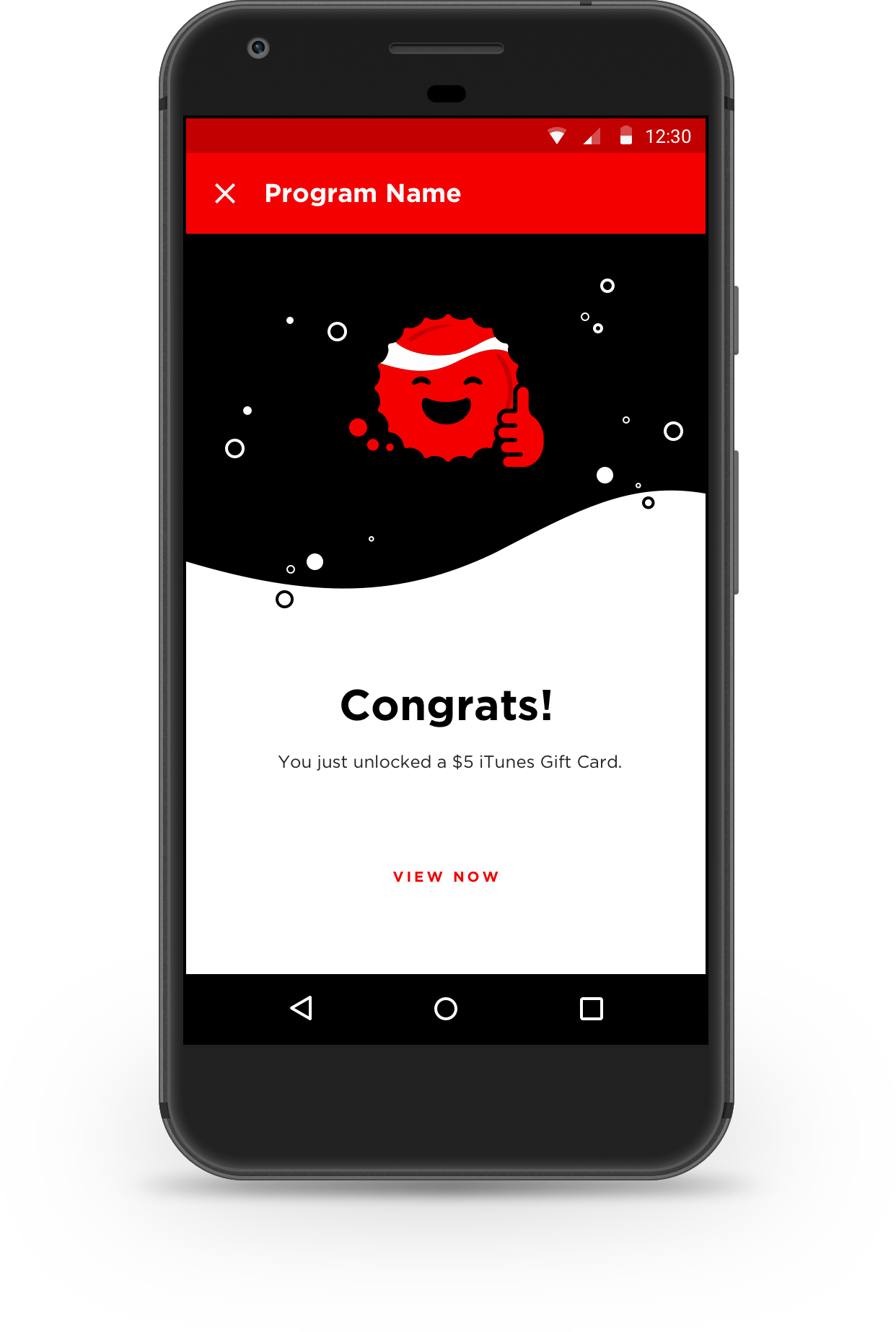
Reward - Unlock Prize
Flexible, Scalable Design
Keeping in mind the client’s goal of being able to scale in size (the number of campaigns live at any given time) and brands (the ability to shop the app to brands within TCCC to create their own campaigns) we created a flexible design system that can easily handle any future needs. We began by brainstorming different campaign types and how they could be mixed and matched to come up with new fun iterations. At the time of beta testing, we had 2 ways to enter a campaign (through code entry or by breaking a geofence) and 3 campaign types (instant chance to win, sweepstakes, and instant reward). These items could be combined to create new campaigns, focused on the values of friendship, community, and togetherness that the brand promotes. We also made sure to incorporate some of My Coke Rewards’ campaigns, to maintain some level of familiarity for super users. By using the campaign types as the cornerstones, we were able to design reusable building blocks that brands could use to customize their own campaigns, while keeping development effort at a reasonable level.

Usability Testing & Iterations
Equally important to the campaigns themselves was the overall experience in exploring the app. In order to make it a fun discovery process, we initially designed the homescreen to be a long branded illustration, with campaign icons serving as entry points. However, when we conducted usability testing, we learned that it was confusing to users. They were unsure what the icons on the homescreen represented, or how they were organized. Based on our results, we redesigned the homescreen interaction model to surface the most relevant information and key interactions more directly. From the first screen in the app, users can scroll through the available campaigns, see their progress, or take the primary action related to each campaign.
Early iterations of the homescreen featured a long illustration with program entry points placed along the image. This proved confusing to the user, and the more intuitive homescreen on the right was created.

Results
After the MVP release, we successfully conducted an internal alpha test with 100 Coca-Cola and IBM employees to gather feedback to be incorporated in future releases. While feedback varied, the clear takeaways were to improve app performance (speed, crashes) as well as continue to improve on the basic functionality (for example, to provide the option of scanning the code instead of only manual entry, which was added in the second phase). All research was synthesized and provided to the client for reference. Final UX deliverables also included the Sketch file with all wireframes, an InVision prototype, app architecture documents, as well as a document outlining the flow for each piece of functionality. Due to budget constraints, the client took the remainder of design and development in house, using our extensive documentation as reference.
The Coke app is a completely rebuilt loyalty app with the ability to grow with the company. By introducing a modular design system, and building the core components of code entry and campaign types, we created a flexible platform that can be filled with multiple types of content. We alleviated the major pain points associated with My Coke Rewards, and focused on building an experience centered around discovery and fun. Expected app release is 2018.


